How to Read and Explain Charts and Graphs
Charts and graphs are often used to summarize data. They make it easy to see trends and the amount of variation in the information being studied.
(A trend is the direction of change in the data. For example, people’s average lifespan has generally increased over the last century, even though in a few war years it declined. So we could say the trend has been for people to live longer than previous generations.)

That’s why it’s important to understand the ways charts and graphs display information.
If you want to take the IELTS academic writing test, you also need to be able to discuss them. Task 1 asks you to summarize the main features of one or more charts and to make comparisons when appropriate.
Technically, graphs are one kind of chart. (Other kinds of charts include diagrams and tables. Charts include any way to visually summarize and compare data.)
The rest of this page will show examples of different kinds of charts and graphs. It will explain them and show the most important vocabulary you will need to discuss them yourself. Be sure to study the title and labels of any chart carefully, so you will know what it tells you (and what it doesn’t!)
The graphs on this page are taken from two U.S. government websites: the CDC and the BLS. (U.S. government data is in the public domain, which means it is not under copyright and may be used and shared freely.)
At the bottom of the page are links to more kinds of charts you can study.
A Simple Pie Chart

Chart Background:
Of 242 total pages (excluding newsletter back issues), 118 or 48% were vocabulary-related. (Just over half of those were practice pages.)
There were 34 pages teaching or practicing reading and other skills (writing & listening). There were 29 for grammar (also about half explanations and half practice pages), and 27 for tests and games, combined. Lesson plans, worksheets, and other help for teachers included 22 pages, and there were 12 other site pages.
Here’s one way to describe this chart and explain its main points:
This pie chart shows the proportion of pages on EnglishHints.com on various subjects. Almost 50% of its pages are related to vocabulary, and more than half of those are vocabulary practice.
The site has approximately equal numbers of pages for skills, grammar, and tests plus games—around 1/8 each. Pages for teachers make up a little under 10% of site content, and a variety of other pages make up the last 5%.
EnglishHints appears to devote about half its content to explanations and examples. The other half is practice activities including tests and games.
Graph: Number of Antidepressant Mentions for Various Age Groups Over Time
")
x axis- horizontal; y- vertical. Remember to study the title and labels of the x and y axes carefully to be sure you understand what the graph is showing and the size of its effects.
This chart illustrates the gradual increase in mentions of antidepressant drugs during visits to outpatient departments between 1993 and 2000.
The y axis shows the number of outpatient visits and the x axis shows the period of time (in this case years) of the study. The colored lines represent different age groups.
For most age groups there is a slight upward trend between 1993 and 2000 in the number of visits with mentions of antidepressant drugs. Between 1995 and 1998 there was a steeper increase in drug mentions for people over age 65.
However, the number of mentions was highest at all times for the age group from 45-64 years old. There were slightly fewer mentions for the over 65 group, and still fewer for people aged 18-44. People under 18 had far fewer mentions.
Important Vocabulary for Charts and Graphs
The IELTS academic writing task 1 asks test takers to study one or more charts and “summarise the information by selecting and reporting the main features, & make comparisons where relevant.”
To summarize (or summarise-- the British spelling) means to give a short account of the most important points or features of a document or speech. Do not just repeat the exact words of the chart or instructions. Express the main ideas in your own words.
To select is to choose. Relevant means related to your purpose. (So you should make comparisons if the chart shows contrasting data.)
Describing Trends, and the Rate (speed) or Amount of Change
An increase means to go up or rise. A decrease means to go down, fall, drop, or decline.
(Increase and decrease are also verbs. “The number of mentions increased over time.”) Verb forms ending in –ed or –ing can be used as adjectives. (Increasingly is an adverb form.)
Examples: “There were steadily increasing mentions of antidepressant drugs between 1993 and 2000.”
“Mentions of antidepressants were increasingly common for people of most age groups over time.”
“No age group showed decreased mentions of antidepressants during the period studied."
You can call a small change slight, minor, insignificant (unimportant) or a slow increase or decrease. If it is a large or fast change, you can also describe it as sharp, major, steep, or significant or a rapid increase or decrease.
Sometimes there is very little change: the situation is stable. Other times there is no single trend up or down, but fluctuations: a line that goes up and down, then up again, like waves.
More Words to Describe Charts and Graphs
Range is the distance between the farthest points. Example: The range of the increase in mentions of antidepressants went from one (extra mention for those under 18) to 15. (15= from 12 mentions to 27 over the years studied for those from 45-64.)
When information is not exact, you can describe it using the words approximately, roughly, about, around, just under, or just over. (See the description of the EnglishHints’ pie chart for ways to use these words.)
Useful transition words to point out a contrast: however, while, on the other hand, in contrast, whereas, or but. (Don’t over-use ‘but’; the other words are more “academic.”)
Useful words for ending your comments with an even shorter summary: in conclusion, to sum up, in general.
___________________________
Graph 2: Wages & Employment for Different Health Professions
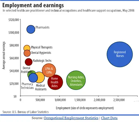
How would you describe or explain the graph on the left?
Try it (now, in your head or on a piece of paper), then compare your answer with my version under the chart.
My example: Description and summary:
This chart compares employment and earning opportunities for various health care occupations in the U.S.
The x-axis represents the number of jobs available (shown by larger and larger employment circles for occupations as jobs increase from 0 toward three million on the far right of the chart.)
The y-axis shows average annual pay. As the average salary of occupations increases, their circles are higher and higher on the chart.
The lowest paid occupations are Home Health Aides (about 900,000 jobs paying just over $20,000). Next are Nursing Aides, Orderlies, and Attendants (with nearly 1,500,000 positions averaging below $30,000, according to the chart.)
Pharmacy Technicians and Dental Assistants have few job opportunities (around 250,000) and low salaries. (Their salaries arearound $30,000/year, although Dental Assistants may earn somewhat more.)
Medical Assistants earn about the same, but have nearly twice the job prospects—almost 500,000 jobs available.
LVNs and LPNs have approximately 750,000 job openings as well as better pay-- about $40,000/year.
Radiologic Techs, Dental Hygienists, and Physical Therapists are paid more. All three groups have small numbers of positions available—200,000 or fewer.
Registered Nurses’ salaries are similar to Dental Hygienists, but they have over 2,500,000 job opportunities. That's far more than for any other health occupation shown.
Pharmacists’ wages are by far the highest of the groups included, although there are only around 250,000 jobs.
__________________________________
Don’t worry if the way you described this data was different from my description. However, you should have mentioned each occupation and compared them for both earning potential and jobs available.
For the IELTS writing task one, the summary must be at least 150 words and accurately fulfill the task requirements in the instructions. It should be well-organized and coherent (connecting your ideas in a logical order). It should also be and cohesive. (That means that it must show the connections between the different things shown on the chart.) Use a variety of words and sentence structures.
More Types of Charts
See this page from the I.R.S. for examples of two pie charts showing U.S. government income and spending (outlay) in 2012. It also includes some questions to help you understand the charts.
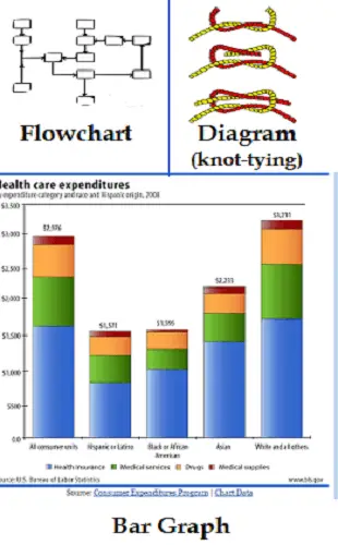
The picture at the top of this page shows an example of a bar graph, a line graph, a pie chart, and a table.
The chart on the right shows another bar graph, a diagram (sketch or picture), and a flow chart. (A flow chart shows the steps in a process. Each box that connects to more than one other represents a decision between two or more possible steps.)
There are also organizational charts that show lines of authority and communication. They illustrate who’s in charge, who reports to each supervisor, etc.
TED Ed has an interesting 4-minute discussion on how to recognize misleading graphs (with a quiz and further information.)
Home> English Language Test Preparation> Charts and Graphs
Didn't find what you
needed? Explain what you want in the search box below.
(For example, cognates, past tense practice, or 'get along with.') Click to see the related pages on EnglishHints.
| site search by freefind | advanced |

")
What's New?-- site blog
Learn about new and updated pages on EnglishHints, with just enough information to decide if you want to read more.

Do you already use English in your profession or studies-- but realize you need more advanced English or communication skills in certain areas?
I can help-- with targeted suggestions & practice on EnglishHints or with coaching or specialized help for faster results. Let me know. I can suggest resources or we can arrange a call.
Vocabulary in Minutes a Month
Sign up for our free newsletter, English Detective. In a few minutes twice a month you can:
- Improve your reading fluency with selected articles & talks on one subject (for repeated use of key words)
- Understand and practice those words using explanations, crosswords, and more
- Feel more confident about your English reading and vocab. skills-- and more prepared for big tests & challenges
For information (and a free bonus), see Building Vocabulary


%20%20This%20is%20an%20important%20skill%20for%20university%20work%20and%20is%20tested%20in%20the%20IELTS%20exam.)
Home | About me | Privacy Policy | Contact me | Affiliate Disclosure
Copyright © EnglishHints.com
New! Comments
What do you think about what you just read? Leave me a comment in the box below.